CASE STUDY
Goodreads
Goodreads is a social media platform for book lovers; users are able to see what their friends are reading while also tracking their own books. Additionally, it is a destination for book discovery and personal recommendations.
Goodreads has both a browser experience and a mobile app, but for this exercise I will only focus on the mobile app.
DEFINING THE PROBLEM
The overall look of the Goodreads app hasn’t changed much in the 10 years I’ve been a user, so I originally went into this project with the goal of refreshing the UI and visual design.
As I began to consider the visual updates I wanted to make, I thought about some of my frustrations with the overall UX and saw an opportunity to also streamline the information architecture.
Improving the information architecture will allow for easier access to all of Goodreads features and make it easier to navigate the app as a whole. Furthermore, updating the UI and overall visual design will improve the visual consistency and help increase the ease of use, simultaneously bringing a fresh, modern look to the app.
DEVELOPING THE DESIGN
INFORMATION ARCHITECTURE
CURRENT
After studying the app more closely, I mapped the current information architecture and found three main areas for improvement:
Home: Should act as a hub for all features, not just a social feed
My Books: Better organize users information
Overall: Eliminate duplicated information/functions
REVISED
The revised IA simplifies the entire app experience, with the homepage acting as a hub then sending the user to another section to see an expanded view of the homepage content and explore further within each section. Additionally, the redundant ways of finding information, such as the Reading Challenge, are consolidated to one place.
WIREFRAMES
Once I felt the IA was in a good place, I drew out some wireframes to give me an idea of where to start with the updated app design.
VISUAL DESIGN INSPIRATION
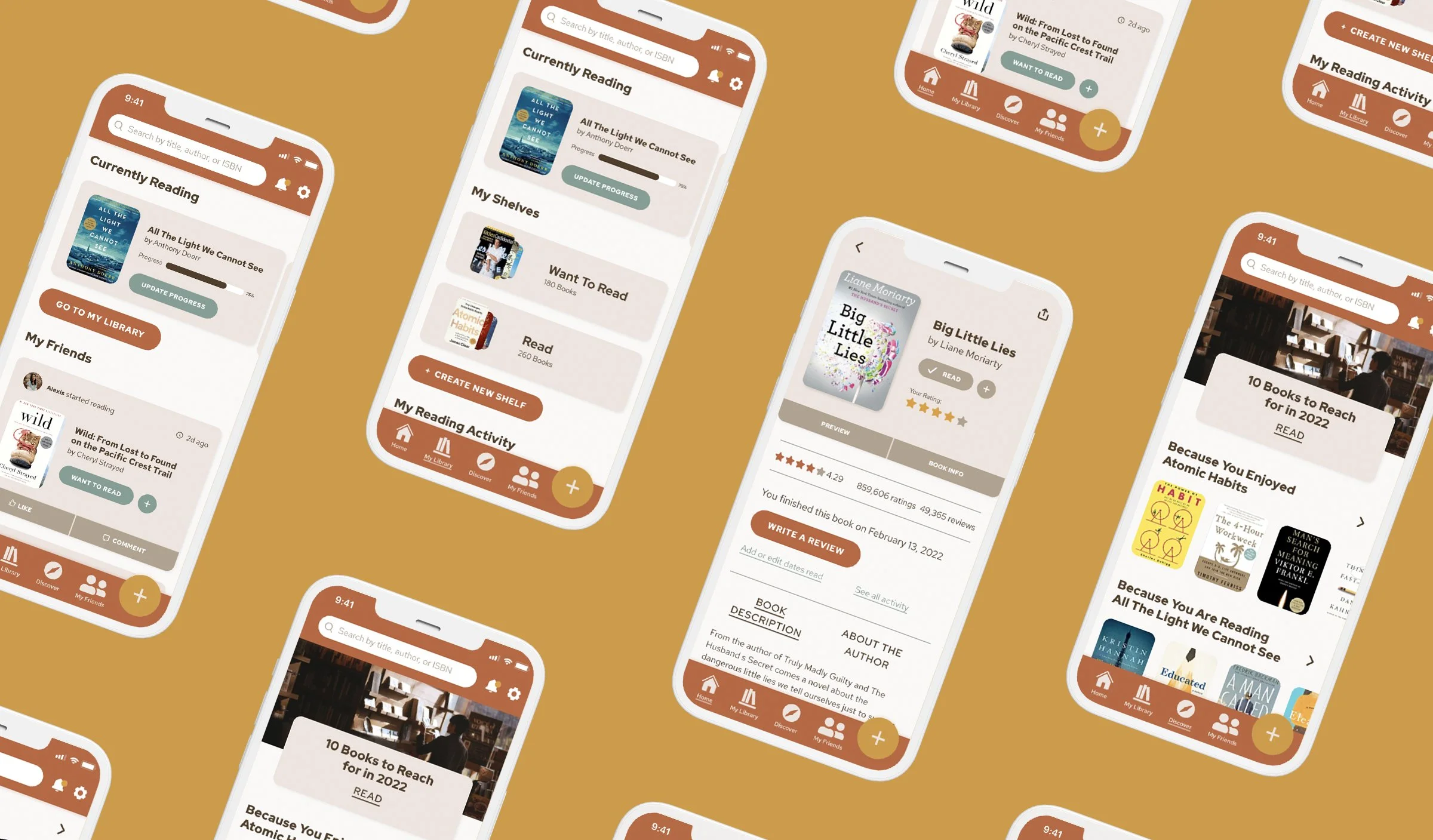
For the UI and visual design, my goal was to make the app feel more cozy and friendly than the current UI was portraying. Since goodreads is all about reading, I took inspiration from cozy places someone might read a book, such as a library or coffee shop. The current tan and brown color scheme fit into my updated vision, but I felt it could be elevated with a slight change in tone and by adding warm accent colors to both freshen the look and act as the hierarchy in the new design system.
VISUAL & UI DESIGN
FINAL DESIGN
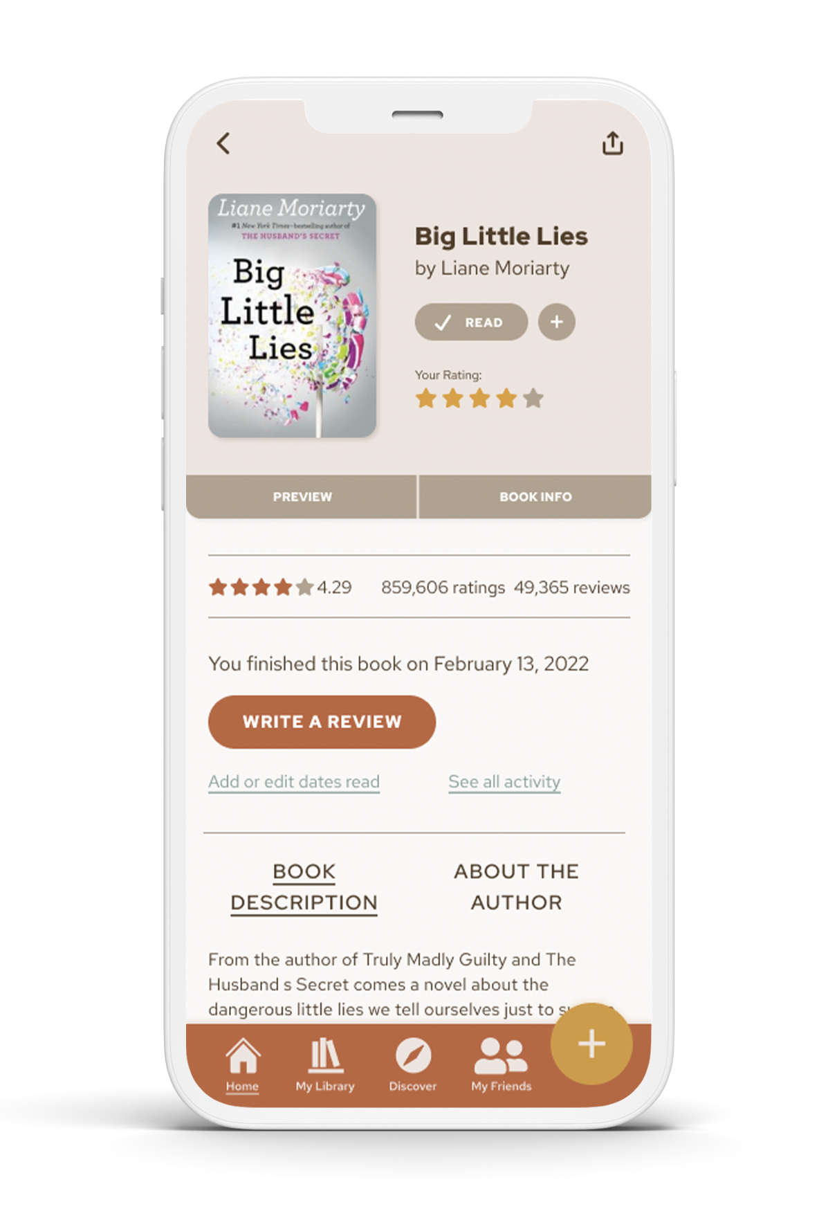
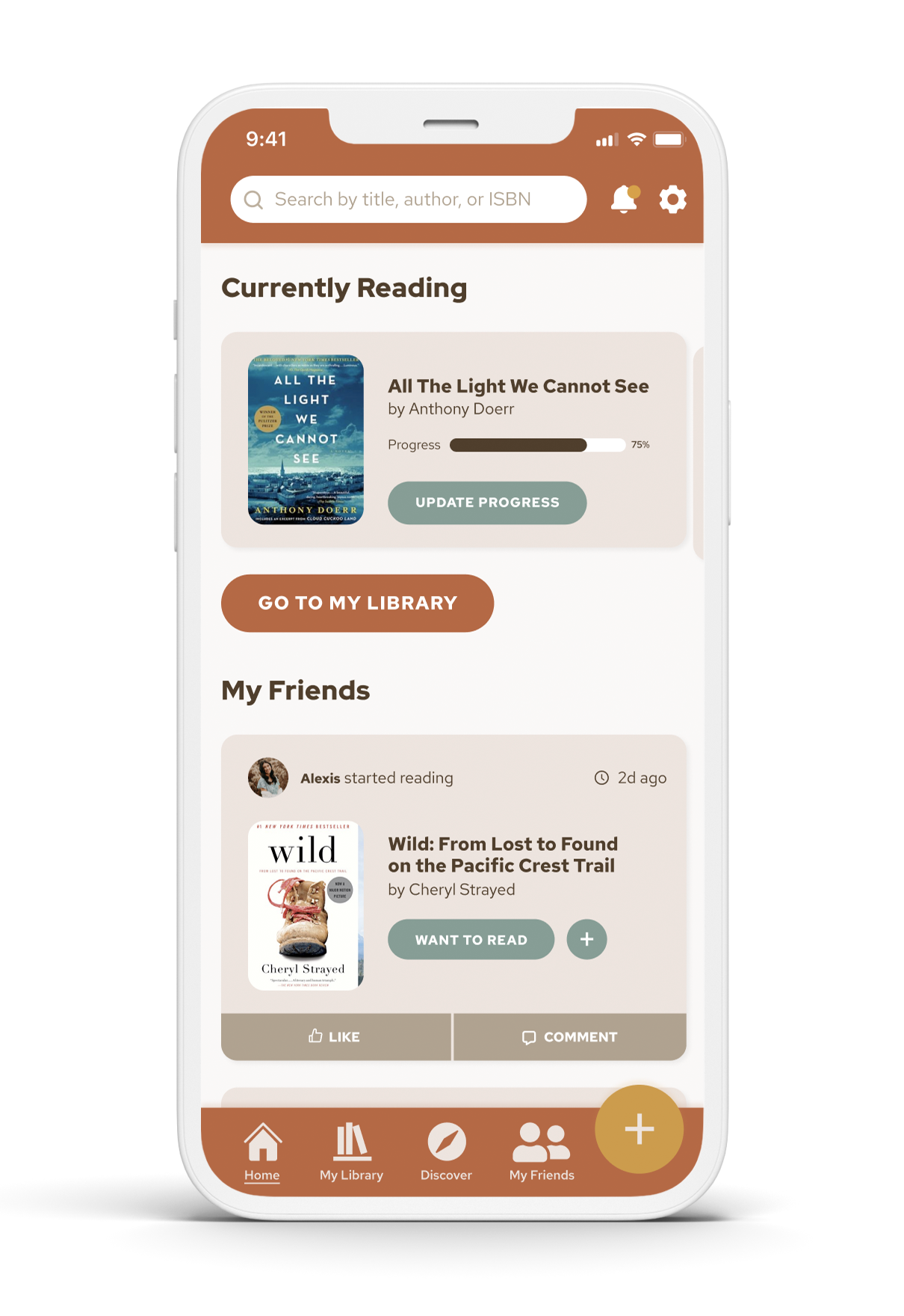
Combining the streamlined IA, new color palette, and refreshed UI, the redesigned Goodreads app has a fresh and friendly feel that is easy to navigate. Whether a user wants to update their reading list, see what their friends are reading, or discover their next favorite read, the updated Home screen allows the user to easily see all available options at a glance. Search, settings, and notifications are always available in the top nav with bolder icons to help with ease of navigation in the main nav bar at the bottom.
NEXT STEPS
To continue to build out my vision of what the Goodreads app experience could be, there is more to be done beyond updating the IA and UI. There are several next steps that can be taken to continue the improvements:
Continue to build out the app by designing additional screens such as My Profile and Reading Challenge
User testing to optimize based on feedback
Map out use cases to consider new features that don’t currently exist


